The Junk Drawer: A straightforward solution to a common problem
If you are like me, you might have a junk drawer in your kitchen. It’s where we toss all the stuff that doesn’t quite fit anywhere else — spoons, empty bags, clips, old receipts, and other assorted not so essential but still important stuff.
One of the most common complaints about websites is that they’re too cluttered or overwhelming to use.
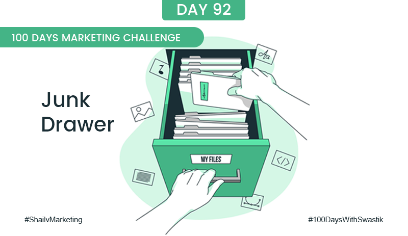
The Junk Drawer is a new way of organising your links.
It’s designed to help you increase conversions by reducing the number of distractions at the top of your page. You can have all the important stuff at the top while hiding everything else in the junk drawer section at the bottom.
The junk drawer section will allow customers to focus on what matters most – making a purchase, download the lead magnet, or signing up for an email list!
I know it sounds unconventional, but I promise that this works!
My clients see improved conversion rates and lower bounce rates when implementing the junk drawer into their websites.
So, review your current website, and if you have navigation at the top or too many links in the header area, plan to move to the bottom of the
page called the junk drawer.
If you want to make sure your website is making the most out of the user experience, look at it and see if there are too many links in the header area. If yes, move them all down into the footer section called the “Junk Drawer.”